How to Create a 3D Dungeon Crawling Effect in GB Studio
It’s both more simple and more complicated than you think.
For GBJAM 12 I created "Doomslinger Dungeon", a 3D-ish first-person dungeon-crawling rougue-lite shooter for the original Game Boy. In the game you move through a dungeon, fighting all kinds of spooky monsters.
This is what moving forward through the dungeon looks like:
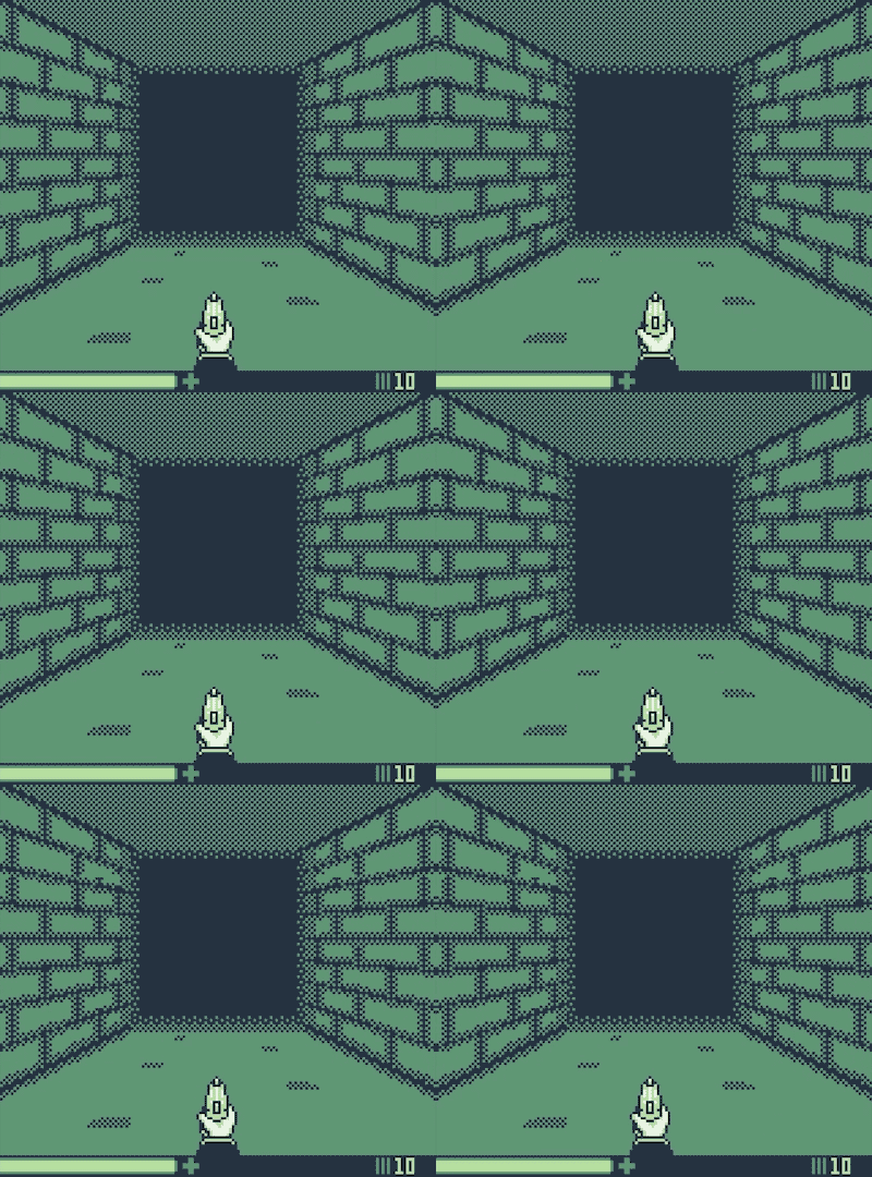
A couple of people have asked me how I have created this 3D effect. That’s why I am writing this tutorial now.
It's done without engine editing, GBVM, submapping or even any plugins (*). Thus, you don’t need any advanced programming knowledge to recreate a 3D effect like this. All you need are palette swaps. Let me elaborate...

The original Game Boy (DMG) can only display 4 different colors. Or to be more precise: Shades of green. To make things easier for this tutorial I will call them white, light green, dark green and black.
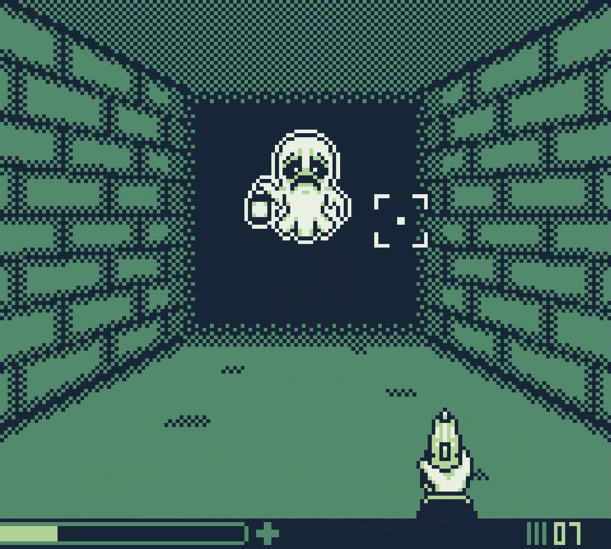
Notice how the background only uses two colors? It uses dark green and black. This does not only allow for a nice contrast to the lighter monster and crosshair sprites. It also leaves us two colors to play with: White and light green. This is the secret to the whole trick.
First, I started off by planning out the layout. Since the original Game Boy has quite the strict limit of how many different 8x8 background tiles can be shown on screen at the same time, it’s important to make sure that the design accounts for this. Both the angles of the wall and the size of the area that is covered in darkness were picked so that I could stay within that tile limit.
So, first I drew all of the lines of the walls (see left side of image below) and tested a couple of different variants before I found one that look nice enough and stayed within the Game Boy’s tile limits.
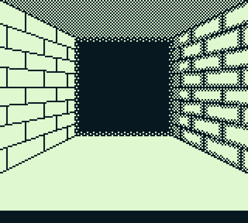
Only having lines looked quite sterile, though. Thus, I added dithering patterns to 1) make the dungeon look older and dirtier, 2) make the transition to the darkness in the distance look less abrupt and give the corridor more depth, 3) give the illusion of using a third color for the background to make it look more complex than it actually is (see image above on the right side).
I only drew the draft in black and white because that contrast makes things easier to see. I then turned everything white into dark green:
Now comes the fun part: Since there are still two colors left that can be used in the background, I could use them to map two states of the same corridor onto a single image. To do this, I colored all vertical lines of the walls and their adjacent dithering pattern in white and added lines and dithering in light green in between like this:
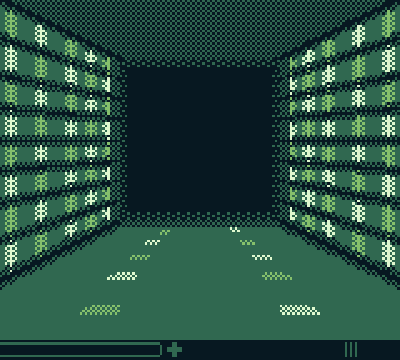
With the dungeon image set up like this, we can now use palette swapping to turn the white of the image into dark green and the light green of the image into black. And voila – the image looks again like it did before coloring the lines white and adding light green lines.
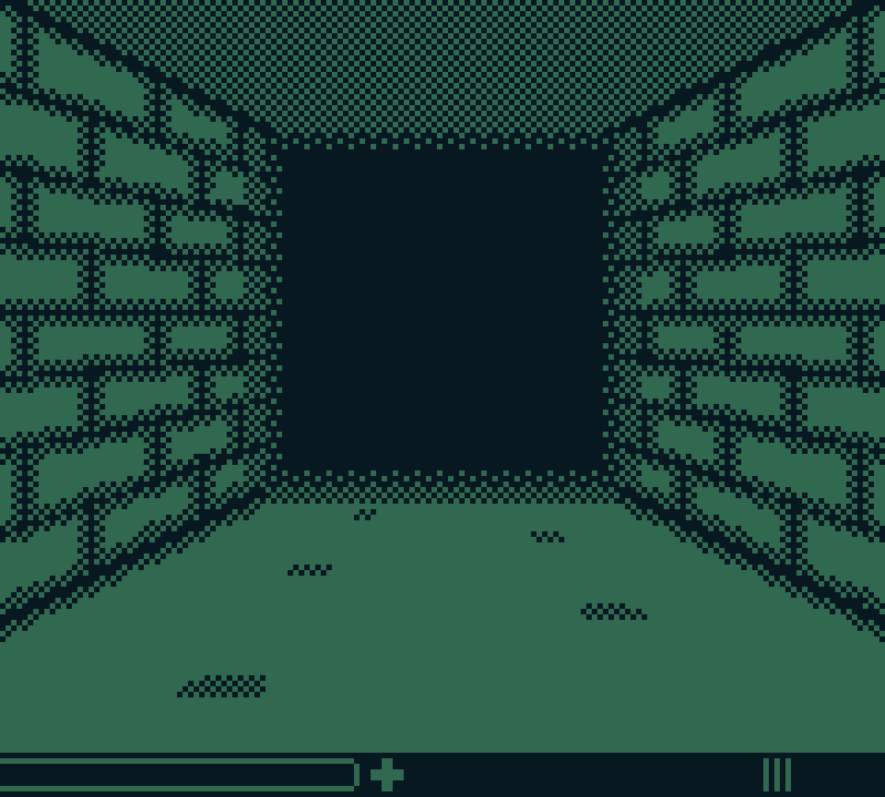
If we instead use palette swapping to turn the white into black and the light green into dark green, we can instead access the second state of the image.

The last step is to alternate between these two states every couple of frames while the player holds Up on the d-pad. Since the player initiates the "movement", two different animation frames are enough to give the illusion of forward movement.
What additionally sells the effect is the “walking animation” of the hand holding the gun at the bottom of the screen, which is basically only a static image wobbling around.
Here’s again what the final effect looks like:

(*) As far as I know GB Studio only offers palette swapping in color mode. To make the game still playable on DMG, I used the amazing SetPaletteColors plugin by NalaFala (Yousurname), which does exactly what the name suggests. The downside to this approach, however, is that it does not seem to work in color mode. To make the game playable on both DMG and Game Boy Color, I used the "If Color Mode Is Available" event to detect which system the player uses to serve them the correct way of palette swapping.
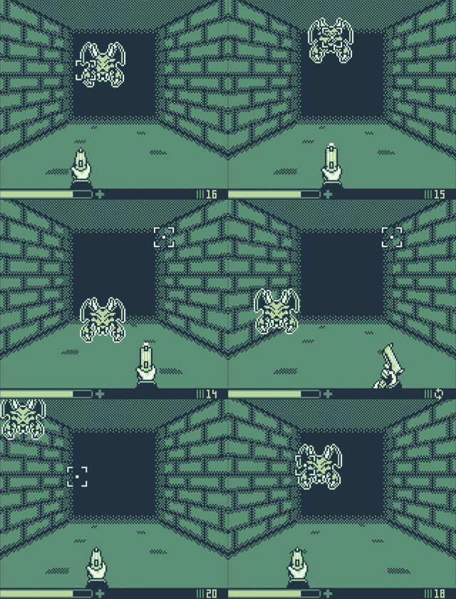
There may be other ways to achieve the same effect. But what is great about this approach, is that it hardly affects the performance of the game at all. Originally, I had tested the effect during battles as well. And everything was still running as smoothly as without it. I only separated walking and fighting because I found the background animation a bit distracting during fights. Here is a recording I have of this test (settings were slightly different):
Btw: I used a similar effect in a racing game and a space shooter within my game “Ghost of the Arcade”. This was also done for a game jam in around 2.5 weeks (plus half a week for fixing all of the bugs players found in the submitted version). Here’s a trailer:
I hope, this tutorial will help you to create an awesome game. If you have created something using this effect, feel free to post it in the comments. I would love to see it.
And if you have any additional questions, you can find me on the GB Studio Discord server :)
Files
Get Doomslinger Dungeon
Doomslinger Dungeon
A first-person dungeon-crawling rougue-lite shooter for the Game Boy.
| Status | Released |
| Author | playinstinct |
| Genre | Shooter |
Comments
Log in with itch.io to leave a comment.
Great game, I'll be doing a live on it before the end of the year, thanks for the explanation of how to create the “depth” mode, I thought you'd done tile swapping, and I think you could achieve a similar result with this method, but with infinitely more trouble than with your “color change”. Thanks a lot :)
Thank you 😊
I haven't tried doing this with tile swapping. But my guess would be that it would run significantly slower on DMG since you would need to swap a lot of tiles but you only have to swap one palette. And yes, the setup process would indeed be quite exhausting 😅
Really interesting to read how this was done
Thanks for reading 😊